ICONS WITH STROKED TEXT. The black outline overshadows the letters.
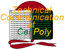
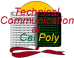
ICONS WITH "STC" BACKGROUND. Background makes text unreadable.
STRAIGHT TEXT. The straight spine seems to impede the readability of the straight text.
Rationale for the logo's format:
First of all, the logo should be able to be resized without loss of quality. The best way to do so is by using vectors (formulas) instead of bitmaps. Vectors can be enlarged or reduced without any loss of quality. Bitmapped graphics that are enlarged or reduced always suffer from aliasing (blocky edges) and blurriness.
Therefore, I used Adobe Illustrator 5.5 to draw the logo. Since vectors only allow for a certain degree of complexity, I limited the art to simple gradients and solid colors. Ultimately, I intended the logo to be a cross between the simple and the complex.
Later, I converted each variation of vector logo into bitmapped GIFs using Photoshop 4.0. Stroked text (text with black outlining) had to be manually edited.
The meaning of the logo:
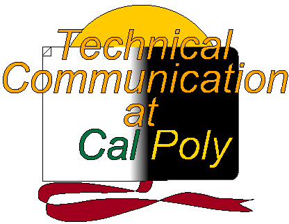
The logo illustrates the union between paper and hypertext in technical communication. I added the bookmark ribbon and sun as artistic compliments. The bookmark ribbon supplements the illusion that the black and white illustration is a book.
Variations on the logo:
Basically, each logo is a shuffling of these four characteristics:
Examples of combinations that didn't fly:
ICONS WITH STROKED TEXT. The black outline overshadows the letters. |
ICONS WITH "STC" BACKGROUND. Background makes text unreadable. |
POSTERS WITH UNSTROKED TEXT. At poster size, stroked text is far superior in readability. | STRAIGHT TEXT. The straight spine seems to impede the readability of the straight text. |
The three superior icons (I prefer the bright red text):
 |  |
 |
Logo variations (Click on linked pictures to see poster equivalent):
 |  |  |
| Stroked text, "STC" background | ||
 |  |  |
| Stroked text, no "STC" background | ||
 |  |  |
| Unstroked text, "STC" background | ||
 |  |  |
| Unstroked text, no "STC" background |
If you have any comments, questions, suggestions, and requests for other variations, e-mail me at saoki@iname.com.
[ BACK TO PROJECTS ]